What Spotify data show about the decline of English
From The Economist Data Team
By Dolly Setton (data collection, analysis and story); Olivia Vane, Martín González, Evan Hensleigh & Andreas Moor (interactive data graphics); Rosamund Pearce (static data graphics); Matt McLean & Ben Shmulevitch (page design); Idrees Kahloon (editor)
What Spotify data show about the decline of English, The Economist, 2022
How we designed our Spotify interactive, Off the Charts: The Economist's data journalism newsletter
The visual challenges of big data: how The Economist turned Spotify data into a story about language, The Online Journalism Blog
How do you visualise musical tastes across the world? That was the challenge we faced working on an article analysing five years of music streamed on Spotify.
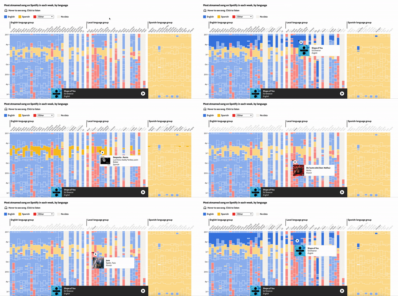
This project looks at the decline of the English language in pop music. We analysed 13,000 hits across 70 countries to track the evolution of musical tastes and linguistic preferences. We found that listeners can be put into three different groups: one in which the English language dominates; one in which Spanish prevails; and a third that mostly enjoys songs in local tongues. The data show that the hegemony of English is in decline—especially in the latter two.
To accompany the article, we visualised the top tracks in 70 countries across 5 years. These range from global blockbuster hits like Ed Sheeran’s exceedingly saccharine and exceedingly catchy “Shape of You” to niche sensations in Japan and Iceland. We wanted to create a visualisation that showed the data we had gathered in a streamlined way, so that readers could explore and listen to the songs themselves—from Polish rap to Brazilian pop. The design lets you see how far a track’s popularity spread and find the hits that broke musical boundaries.
Find the article here. For a behind-the-scenes view of how we developed the project, read our Off the Charts newsletter and an interview with The Online Journalism Blog.
This project won SILVER in 'Arts, Entertainment & Culture' at the Information is Beautiful Awards 2022.

